Assignment 3 is done and it is getting more interesting and tougher. Ming Thein has been true to what he said since the beginning. No sugar coated comments and he is a very tough (extra tough, I'd say) critique with very detailed descriptions of why your submissions are good or bad. All that is great because it is meant for learning and nothing is personal. So what about the assignment, it is mainly to make conscious use of negative/empty space while maintaining balance.
NOTE: Balance is not to be confused with symmetry. And I'd like to use one of Ming's photos as an example.
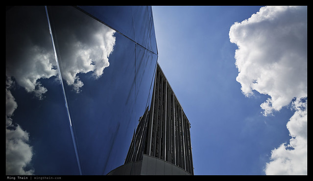 |
| Nearly symmetric, but visually balanced. The two are not the same thing. |
Ming actually had an article related to this assignment and you can read about it here. It is about Compositional Theory.
Balance is not the same as symmetry; the latter can be the former, but the former isn't always the latter. It is about ensuring equal visual weight across the frame, both horizontally and vertically. This prevents the eye of the viewer from roaming and being distracted by other elements in the frame than your subject. The term that Ming used is "Visual Weight". A large dark area is heavy, and a light one is light. Good compositions need to have similar amount of both light and heavy, and these elements should be arranged in such a way that they either interfere with each other so as to compliment or suggest a relationship, or don't interfere at all with sufficient separation to keep the elements isolated and outstanding. The second part of balance is ensuring that your subject and frame are in harmony. For example, don't put a vertical subject in a widescreen frame. Make sure that the shape of your frame at least matches the shape of your subject. This is mostly a copy and paste from Ming's email about the assignment.
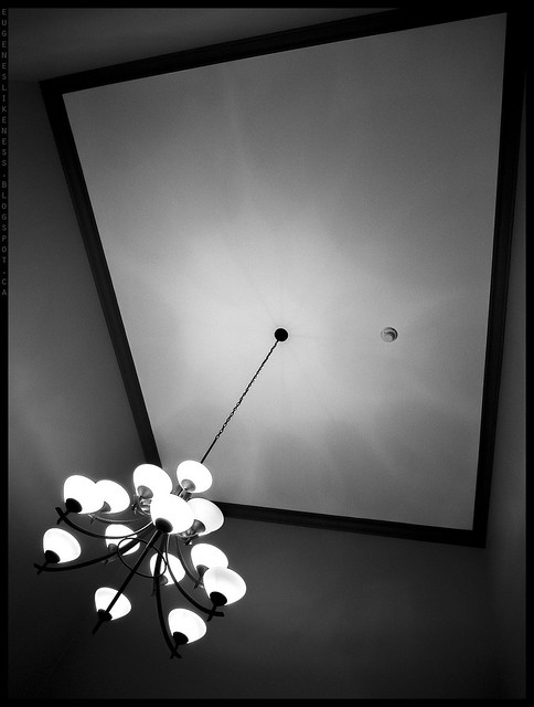
Let's look at my submissions and Ming's feedback.
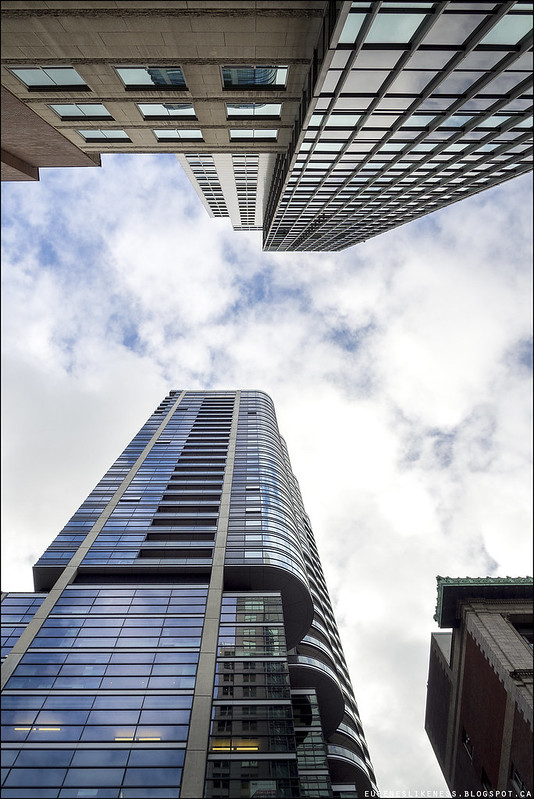
What do you think, good or bad image?
According to Ming: "This one looks a little haphazard to me. I think it's because there's a lot of strong natural geometry and parallel lines, but they don't really translate to either order or chaos (abstraction) within the frame. I think you've got to go with one or the other - the former would have your image looking like Urban Geometry but vertically oriented, the latter would put the tree in the centre and have the buildings framing it - this would probably work better, and avoid the feeling that the bottom of the frame is a little cut off."
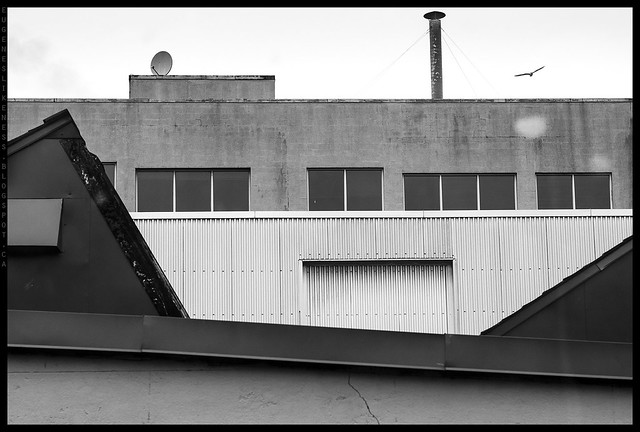
You're probably wondering, where is the negative/empty space here. It is the sky and the bottom wall.
Ming's comment: "Mostly good but I'd have left a bit more space between the top of the chimney and the sky; it's very tight and you've got a little bit more space to play with at the base of the image. Left-right is okay, but I wonder if it might have worked better if you included the whole triangle roof on the left, excluded the right one, and put the chimney top right - having a natural diagonal going on from bottom left to top right. Nice timing with the bird."
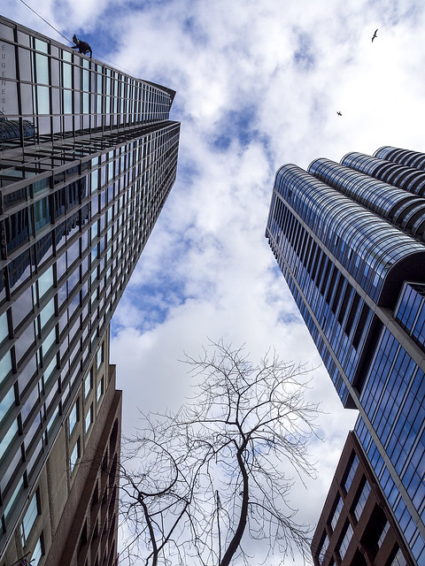
And here's the last photo for this post. I did not include it in my submission but I showed it to Ming and he said it's better. I should have included it :).
My next assignment is about subject isolation. Ming said there are FIVE ways to isolate your subject. Can you name all five? I get bonus points for use of multiple ways of subject isolation but penalty points for overuse of bokeh. You're probably asking again why? According to Ming overly shallow DoF removes any background context, which weakens storytelling in an image. Bokeh is a touchy subject for people that love it. I love it but there's good and bad usage of it. It all depends on what you're trying to impart with your photo. Happy shooting!
Thank You Eugene! - Eric Hanson
ReplyDeleteThanks Eric.
Deletegood stuff
ReplyDeleteThanks Ranti!
Delete